Virtual Assistant
Chatbot designClient
- Obfuscated to maintain client anonymity
Services
- Responsive chatbot design
- Design research
Deliverables
- Virtual assistant screens
- Interactive prototype
- Updated design library components
Team
- Testers
- Product owner
- Project manager
- Developers

Project Info
Challenge
Research done by the client for this engagement indicated that users were finding it difficult to obtain information promptly. As well as restructuring the site, one of the research outputs was implementing a chatbot style virtual helper. The client got in touch with the ask that I provide interactive designs that they can use to test with users.
The chatbot needed to be an extension of the website. Providing a quick and efficient way for users to obtain and locate information via a single conversation. One of the key shortcomings I’ve seen in other chatbots across the web is cluttered UIs with various irrelevant options and positioning that’s sometimes too prominent. I wanted to keep this in mind and ensure I don’t make the same mistakes within my design.
Solution
We had no research budget for this project, as it was all done by the client. But that didn’t stop me from testing with friends, family, & strangers.
I started by creating a map of everything I thought was important for users using the virtual assistant. I was trying to place myself in the user’s position and think about the sorts of questions I’d ask. Would I want to reset my password? Get quick links to FAQ articles? Would I need to upload files or export the conversation?
After I documented all my assumptions, I set out to ask others via a questionnaire and created a map of all the feedback I received. I used the research to create a design that was familiar and intuitive. Throughout this project, I continually and unofficially tested designs and iteratively improved the design.
The journey
Creating a seamless experience
When designing this virtual assistant, I wanted to ensure my designs were consistent and familiar. My vision was to have a lean journey that was a pick-up and play experience. One that didn’t need to hold your hand and guide you because it was using design cues that have been available for years. I wanted to create an experience that utilised space effectively and only showed you options when it made sense.
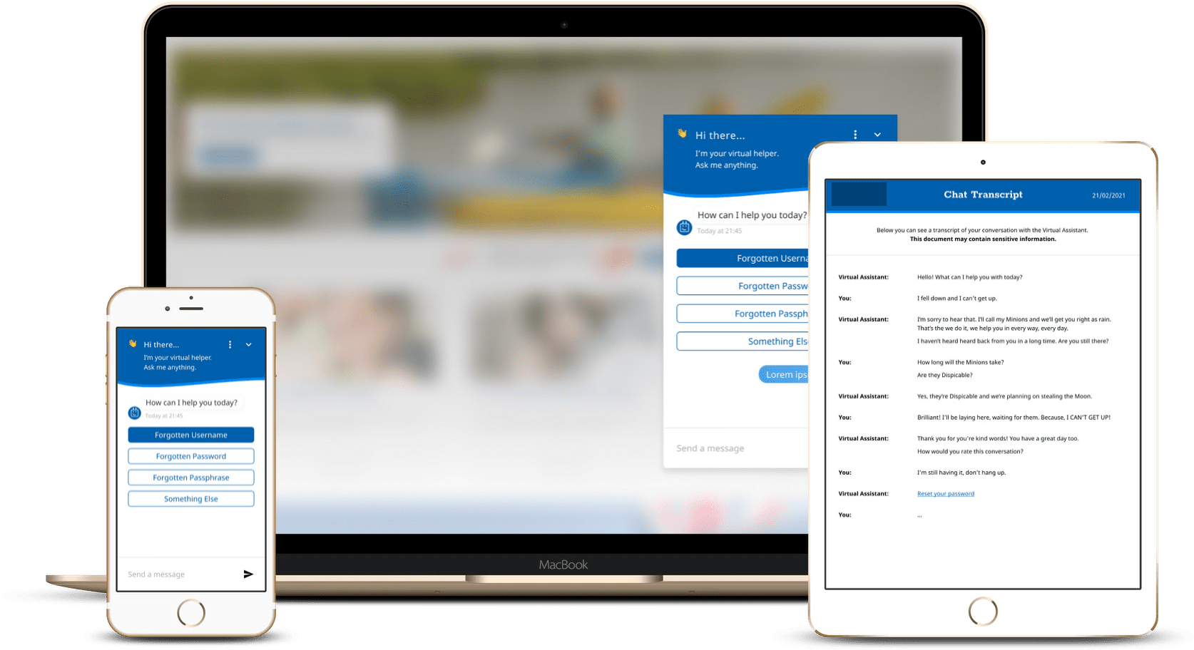
Below is effectively the journey users on mobile devices would take to access and use the virtual assistant. The initial screen displays the option to partially hide the assistant on mobile, so it’s less distracting, letting you focus on the content of the site. With a single tap, it makes itself visible, greeting the user and informing them of the purpose of this little helper. A final click, and you’re in! You get to communicate with a smart little robot to help you get stuff done. On-screen three, you can the familiar typing cue from the robot (it’s animated), and the final screen shows you what happens when the assistant has a few options for you to choose from.
Although not visible on the screens below, the chat is ‘smart’ and shows you options based on the situation. When you’re not typing, you get the option to attach a file when you’re typing; the upload attachment option becomes a send message helping to keep the UI focussed on the use case removing distractions. I’ve also included a view for displaying previews of links the chatbot recommends to the user so they know where they’ll end up before even clicking the link!


Consistent
A great experience across devices
I wanted everything to be as close to the same as possible; therefore, there are few differences between the virtual assistant on mobile and desktop.
The sizing across mobile and desktop obviously differs, and rather than providing a full-screen view of the chat; the user can select three distinct sizes on desktop.
As the virtual assistant was discreetly placed in the bottom right corner, I decided to remove the option to minimise the chatbot on the desktop and opted for a translucent bubble (non-expanded view) until the user hovers their mouse over the virtual assistant. I also added the option to place the assistant on the left-side of the screen, with the ultimate goal of having the option to snap to any corner (or side) of the screen.
Straight forward throughout
Designing beyond the screen
The virtual assistant has been designed to be very simple and easy to navigate. I used design cues that have been tried and tested for many years to keep the assistant familiar. For example, using chat bubbles to show the flow of the conversation between the user and the AI. It’s so widely used in messaging applications that it just made sense to use it and not reinvent the wheel. But that only works for digital design.
One of the use cases for the virtual assistant was exporting chats. A user would want to have a conversation and then export that entire conversation to be kept safe in a file somewhere in their house. For this, I’d need to design a PDF that looked consistent with the virtual assistant but still worked and was effective in print.
Initially, I tried to keep the bubbles, but it became a mess. It was hard to keep track of the conversation, and it really only made sense on a screen. It seemed pretty foreign on paper. So I began researching solutions others have used. I couldn’t find another chatbot that exported chats in a way that I liked; they seemed overly compact and difficult to understand, or on the contrary; they were so ‘simple’ that most of the screen was bare, producing a substantial number of pages for quite a brief conversation. I settled on an approach that’s similar to that of a movie script. Something that needs to be read day-in, day-out by actors and actresses. It provided a level of clarity that I couldn’t find elsewhere.
Because this is a PDF document, I included the option to open links within the PDF. As you can see, the “Reset your password” text is blue, indicating it’s a link. I didn’t include the preview feature available in the virtual assistant as it impacted the document’s readability. As you can see, the final design is a streamlined and easy to read document that shares styling with the virtual assistant but has been designed for a different medium.

