Security Dashboard
Dashboard DesignClient
- Obfuscated to maintain client anonymity
Services
- Dashboard UI design
- Competitor analysis
- UX research & testing
- Basic front-end development
Deliverables
- Comprehensive network security dashboard screens
- User testing reports
- Styleguide
Team
- Developers
- Product owner

Project Info
Challenge
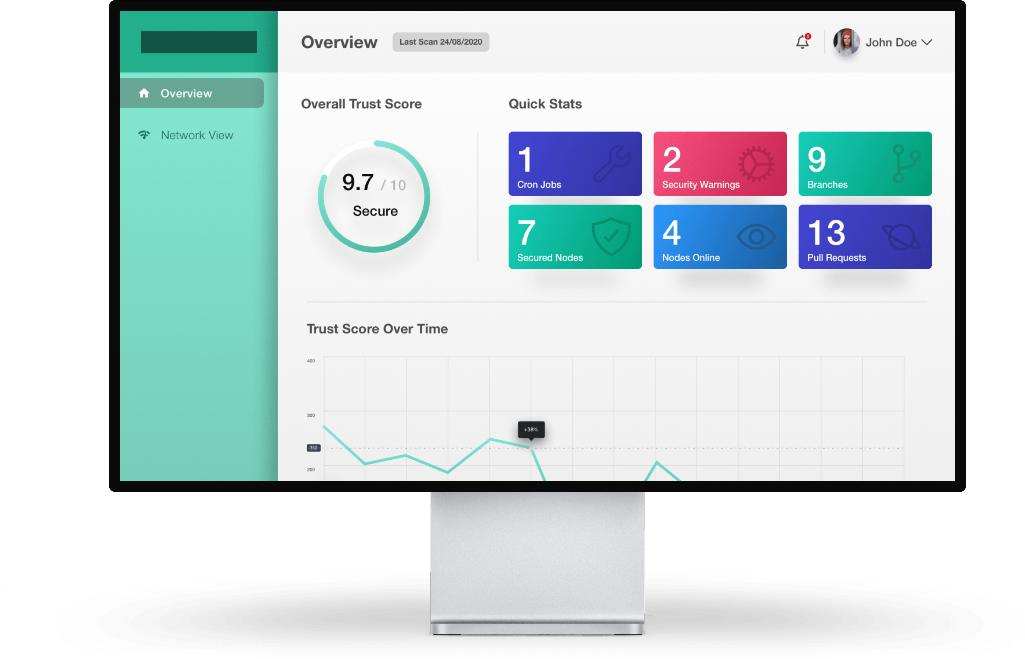
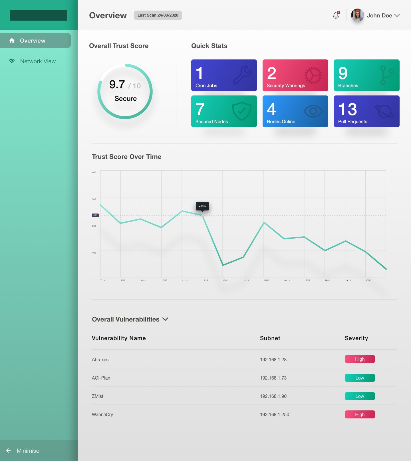
Our goal for this engagement was to create an eye-catching, vibrant dashboard that allowed network administrators to manage their network easily. With a limited budget, time, and resources, I needed to iterate the wireframes quickly and develop a cost-effective method of user testing my designs.
During this project, it was imperative that I understood the requirements set by the business and validated them efficiently with users so that iterative improvements could be made to the wireframes without affecting development.
Solution
My first step in tackling this project was to conduct as much research as possible prior to meeting the client. This upfront research provided me with insights into the workflow of administrators and what they valued most when using dashboards. The research also enabled me to speak to the client using technical language he was comfortable with, which allowed me to demonstrate that I have knowledge in the subject area (gaining a level of trust) and allowed me to utilise my time with the client more efficiently by asking advanced questions which assisted me during the ideation phase. Regular gorilla testing sessions were carried out, as well as team whiteboarding sessions to ensure the design direction was in line with expectations and feasible in the allocated time.

Research
Theme support
I discovered many insights into the lives and workflows of administrators; one ‘need’ that was deemed a requirement was theme support.
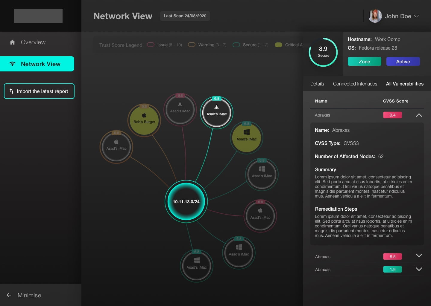
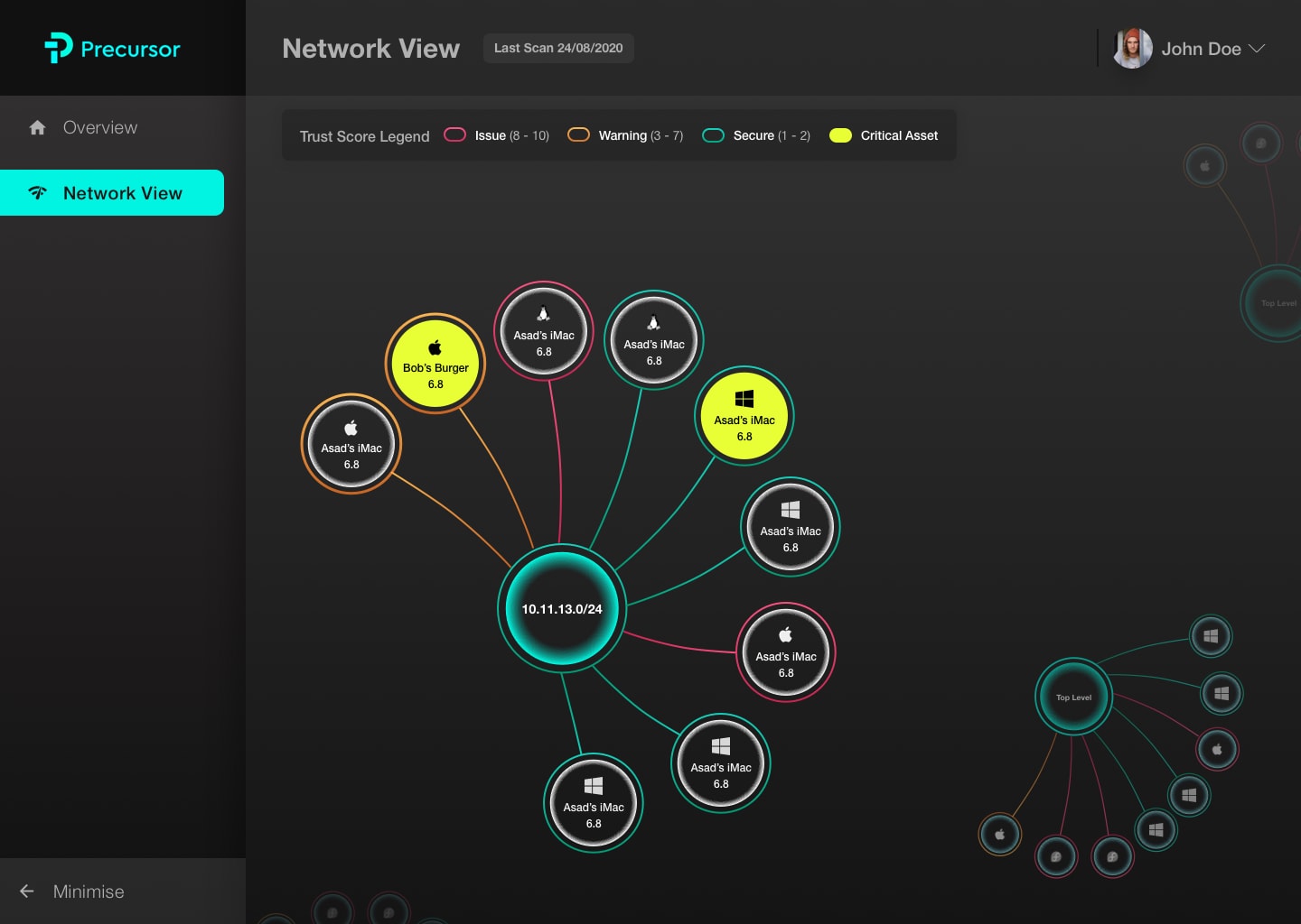
I discovered that admins typically don’t work a 9-5 role and are required to work their regular hours and clock in if an issue arises that requires their attention. That means that although not a regular occurrence, admins may need to access the dashboard any time of the day or night. Integrating support for both a dark theme as well as a light theme would improve the users’ experience by reducing the fatigue and strain caused by bright screens in dim rooms.
Logical. Concise. Beautiful.
Assumptions disproved
Like most projects, initially, I had assumptions about the users and their workflows. I knew that the users were ‘admins’, and I thought I knew how they worked and what they wanted out of the system. But soon after I conducted research, it was evident that my initial assumption (based on experience) that admins valued data above the visual style was incorrect. Users were vocal that they wanted a more balanced on-screen space utilisation. The consensus was that the UI should incorporate only vital information within the context of immediate use, with information that’s not commonly accessed either not displayed or hidden.
This approach creates a UI that works well for network admins, who have a very focused workflow. Admins would typically isolate a single node in a network and branch outwards when identifying network issues instead of viewing the entire network and digging into problematic devices.


