ZenAuto Navigation
Desktop & Mobile Navigation redesignClient
- ZenAuto
Services
- Redesigned navigation across mobile and desktop
- UX research & testing
Deliverables
- High-fidelity navigation screens
- Interactive prototype
- User testing reports
Team
- Developers
- Product owner
- Project manager

Project Info
Challenge
This engagement aimed to improve the ZenAuto site navigation across mobile and desktop devices to decrease bounce rates, increase conversions, and ensure that navigation is easy, consistent and seamless across viewports and devices.
Prior to the navigation redesign, the ZenAuto website had a single burger menu style navigation that was used across all devices from mobile through to desktop. The menu was unintuitive and structured in a way in which it was difficult to find what you were looking for. There wasn’t a direct link to view any vehicles, navigational items relied solely on text and any icons that were used were inconsistent in style across viewports. The entire navigational structure, hierarchy and design of the navigation needed to be revisited and reworked from the group up.
Solution
As with all of the projects I undertake, research was paramount to ensuring a successful project outcome. I wanted to understand what users wanted, what competitors were doing and if the designs that I was producing met user needs, expectations, wants and, most importantly, addressed their pain points.
Recent studies carried out by reputable industry veterans such as the NNg have discovered that the burger menu is shown to reduce conversations, especially on desktops. To address this I designed two unique navigations tied together with consistent styling and navigational elements. The designs that I produced went through multiple rounds of rigorous remote, unmoderated testing sessions and A/B tests to ensure the new navigation has marked improvement in accessibility, functionality, and ease of use in comparison to the current navigation.

Tree testing
Prioritised links
Site navigation is one of the most important aspects of a website. Our primary focus was to understand consumer purchasing behaviour and the information people prioritised when leasing a vehicle. We used usability testing and tree testing for this. Based on the data we received; we could then ensure the new navigation design made it easy for users to find exactly what they were looking for with links placed in a logical order.
I created dedicated links for the most crucial aspects of the website, to ensure the structure was sensible and it was easy to find a specific vehicle in as few steps as possible
Removing ambiguity
Not everyone’s a car expert
I like my cars. I’m no expert by any means, but I know a thing or two when it comes to cars. The previous version of the ZenAuto navigation and website made it difficult to navigate a specific vehicle type (the only link on the nav to view vehicles was to view special offers). The only way to find a specific vehicle when landing on the site was to use the vehicle type dropdown with really vague labels. I mean, what’s a city car or MPV?
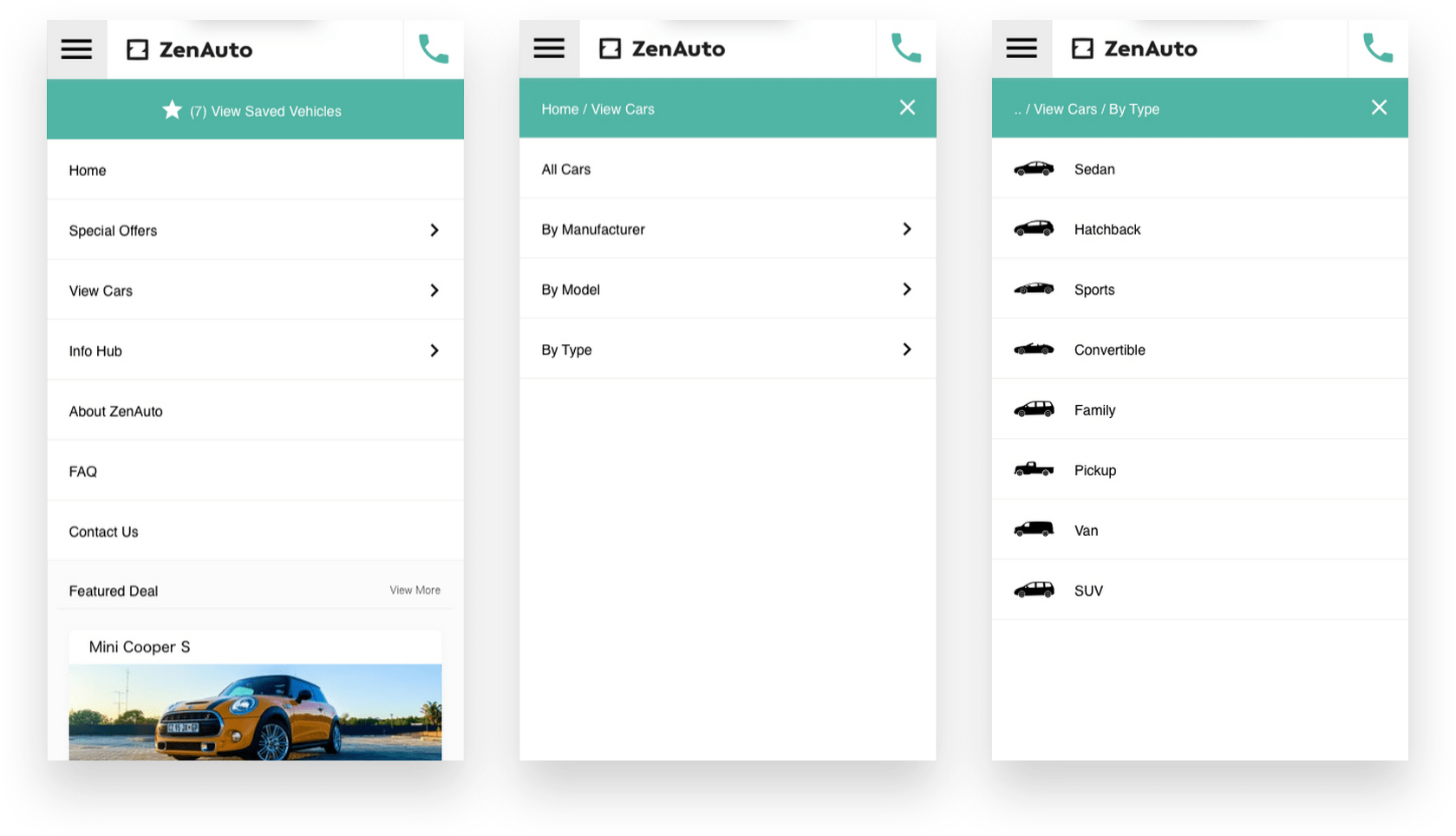
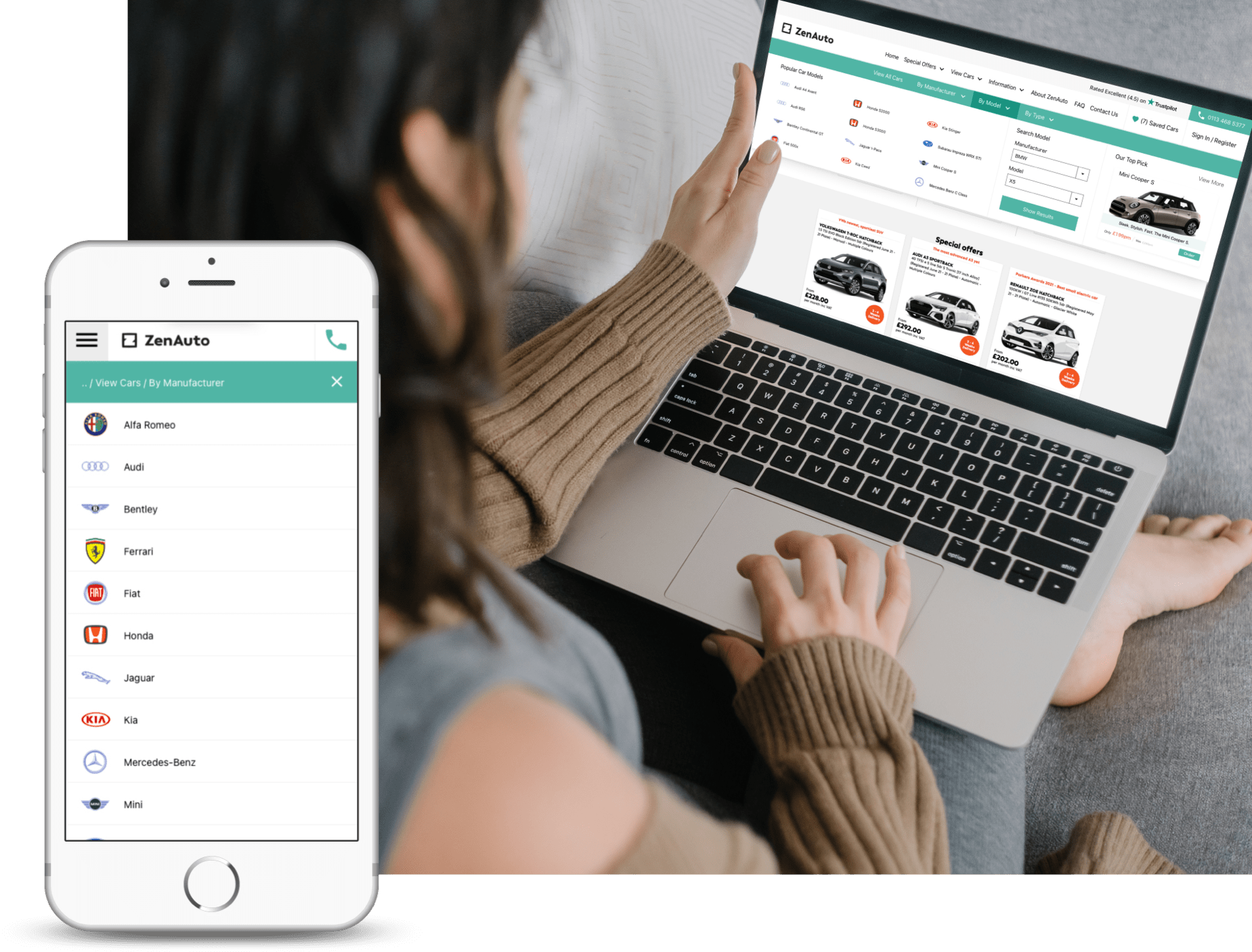
Either every user was an expert, or this was an issue for users. So I set out to do some research in the form of questionnaires and usability tests. It turns out not everyone was an expert, and even users that deemed themselves to be knowledgeable with cars were stumped with some of the labels used for car types. So I investigated various ways to make regular people who have very little interest in cars comfortable picking the correct type of care they needed without pause or hesitation. The solution I proposed which was implemented included visual cues such as iconography and manufacturer branding in relevant parts of the website.
When retesting the designs with visual cues, we achieved a 100% success rate (and some major props) when users were asked to find a specific vehicle.

A Massive Improvement
Virtually every aspect of the navigation has been improved

I redesigned the entire navigation from the ground up using user research. From the final testing session, the feedback was overwhelmingly positive in comparison to the original navigation. Users were comfortable using the navigation, completed all tasks blazingly fast, and appreciated the redesign.
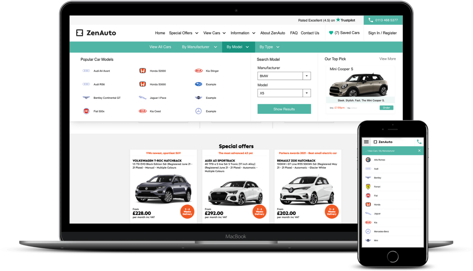
Although both desktop and mobile navigations have been improved a vast amount, I want to focus more on the desktop as it’s undergone the biggest change. Originally we had a white bar with a burger menu icon. It required a click to see menu items and didn’t contain any other information to users. Even when the user expanded the burger menu, it wasn’t great. Lacking a way to view specific cars, or to view the vehicles you’ve saved.
As you can see from the screenshot above. We now (rightfully so) have two navigations, one for desktop and one for mobile. From the desktop navigation, you now have quick links to login or register, get information about the business, filter down to a specific vehicle, save vehicles and contact ZenAuto via phone (which was the most used method of contact from users). Finally, to finish off the modernised menu, I included the TrustPilot score so that users experience a sense of trust and security when browsing around.
The ZenAuto navigation redesign is likely my favourite project. It was super fun to create, the teams were amazing and whilst I was improving user’s experiences, I had a great experience, which was awesome!
